
|
Training, Open Source Programming Languages |
| Home | Accessibility | Courses | The Mouth | Resources | Site Map | About Us | Contact |
| For 2023 (and 2024 ...) - we are now fully retired from IT training. We have made many, many friends over 25 years of teaching about Python, Tcl, Perl, PHP, Lua, Java, C and C++ - and MySQL, Linux and Solaris/SunOS too. Our training notes are now very much out of date, but due to upward compatability most of our examples remain operational and even relevant ad you are welcome to make us if them "as seen" and at your own risk. Lisa and I (Graham) now live in what was our training centre in Melksham - happy to meet with former delegates here - but do check ahead before coming round. We are far from inactive - rather, enjoying the times that we are retired but still healthy enough in mind and body to be active! I am also active in many other area and still look after a lot of web sites - you can find an index ((here)) |
|
Colour doesn't have to mean colourful
In my early days of putting together websites, I used to confuse "colour" and "colourful". It's a common trait of the programmer who's required to do a little graphics art as well to use string, vibrant colours and pictures ... but there are actually times where subtle colouring is much more effective. Here are three pictures taken in the last couple of days. Yes, they ARE colour pictures rather than monochrome ones, but the colour is all the more effective from being subdued. 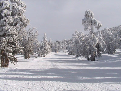 Near the top of a ski run, South Lake Tahoe 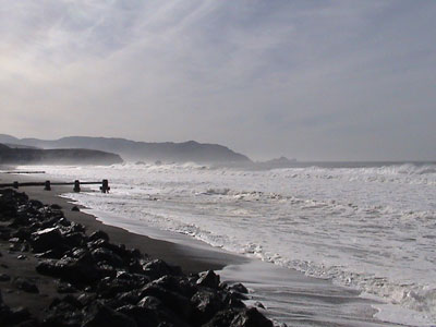 The Pacific Ocean at Pacifica, near San Francisco 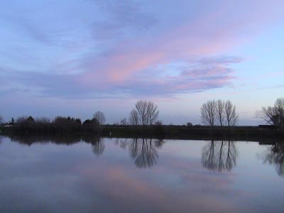 Sunset over the levees, south of Sacremento, California (written 2006-01-06, updated 2006-06-05) Associated topics are indexed as below, or enter http://melksh.am/nnnn for individual articles W512 - Web and Intranet - Site Design Aspects[229] A fortunate accident - (2005-02-27) [261] Putting a form online - (2005-03-29) [288] Colour blindness for web developers - (2005-04-22) [319] Accommodation and landing pages - (2005-05-21) [345] Spotting a denial of service attack - (2005-06-12) [352] Improved mining techniques! - (2005-06-19) [391] One mans pleasure is another mans poison - (2005-07-26) [510] Dynamic Web presence - next generation web site - (2005-11-29) [649] Denial of Service ''attack'' - (2006-03-17) [718] Protecting images from theft - (2006-05-12) [795] Remember a site's non-technical issues too - (2006-07-07) [823] An excellent use for a visitor count? - (2006-08-05) [859] Put the answer in context - it may be printed - (2006-09-08) [918] Databases needn't be frightening, hard or expensive - (2006-11-08) [1015] Search engine placement - long term strategy and success - (2006-12-30) [1047] Maintainable code - some positive advice - (2007-01-21) [1054] UK legal requirements for your commercial web site - (2007-01-27) [1353] Mood shots - (2007-09-16) [1598] Every link has two ends - fixing 404s at the recipient - (2008-04-02) [2214] Global Index to help you find resources - (2009-06-01) [3517] Tags used in writing this blog - (2011-11-12) [3563] How big is a web page these days? Does the size of your pages matter? - (2011-12-26) [3589] Promoting a single one of your domains on the search engines - (2012-01-22)
Some other Articles
The fencepost problem''I don't know'' is sometimes a good answer Converting between acres and hectares A new sign Colour doesn't have to mean colourful Hotel novelties What backup is adequate? Keep that image small Keeping Customers Informed 2006 - Making business a pleasure |
4759 posts, page by page
Link to page ... 1, 2, 3, 4, 5, 6, 7, 8, 9, 10, 11, 12, 13, 14, 15, 16, 17, 18, 19, 20, 21, 22, 23, 24, 25, 26, 27, 28, 29, 30, 31, 32, 33, 34, 35, 36, 37, 38, 39, 40, 41, 42, 43, 44, 45, 46, 47, 48, 49, 50, 51, 52, 53, 54, 55, 56, 57, 58, 59, 60, 61, 62, 63, 64, 65, 66, 67, 68, 69, 70, 71, 72, 73, 74, 75, 76, 77, 78, 79, 80, 81, 82, 83, 84, 85, 86, 87, 88, 89, 90, 91, 92, 93, 94, 95, 96 at 50 posts per pageThis is a page archived from The Horse's Mouth at http://www.wellho.net/horse/ - the diary and writings of Graham Ellis. Every attempt was made to provide current information at the time the page was written, but things do move forward in our business - new software releases, price changes, new techniques. Please check back via our main site for current courses, prices, versions, etc - any mention of a price in "The Horse's Mouth" cannot be taken as an offer to supply at that price.
Link to Ezine home page (for reading).
Link to Blogging home page (to add comments).
PH: 01144 1225 708225 • EMAIL: info@wellho.net • WEB: http://www.wellho.net • SKYPE: wellho
PAGE: http://www.wellho.net/mouth/556_Colo ... urful.html • PAGE BUILT: Sun Oct 11 16:07:41 2020 • BUILD SYSTEM: JelliaJamb